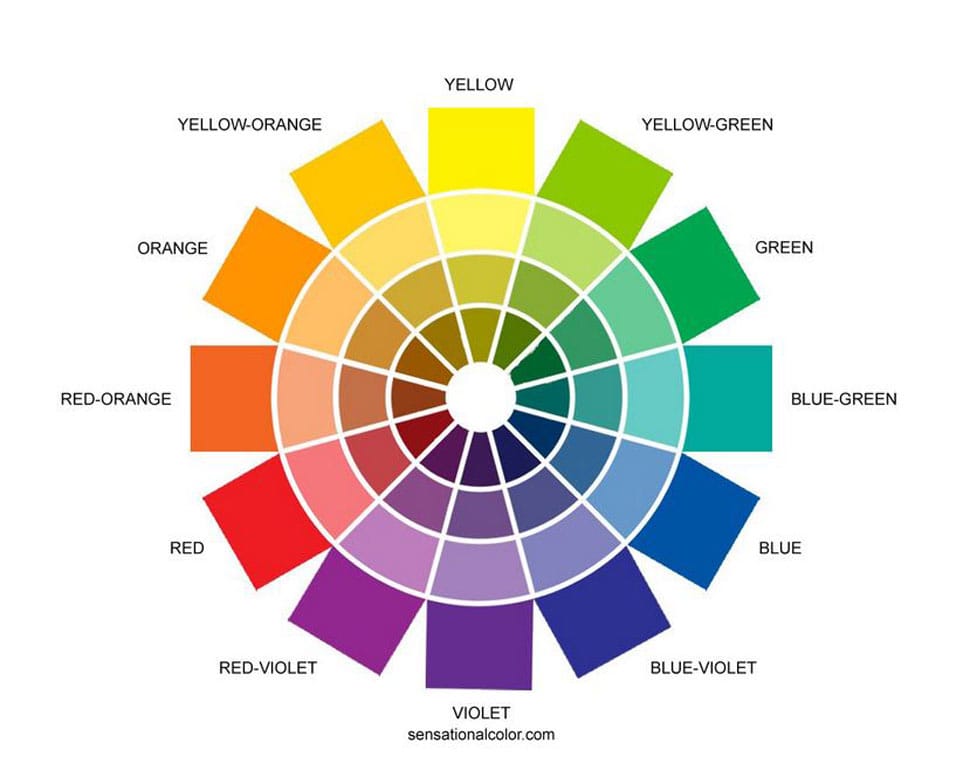
Image is shared on https://www.sensationalcolor.com/color-wheel/
Get to know the color wheel.
When I think back to color theory classes I had at the New York School of Interior Design, my most vivid memory is sitting at my drafting table in my studio apartment mixing various colors of paint. My instructor believed that an interior designer should have as intimate a relationship with color as an artist does.
The color wheel shows 24 basic colors in the proper relationships. Students of color must learn to recognize three qualities in every color sample: hue family -the position on the color wheel; tonal value- degree of lightness and darkness; and chroma- the degree of purity, intensity or saturation. The color wheel helps you understand frequently used color combinations, and whether they reside on opposite sides of the color wheel as complimentary colors or next to each other as analogous colors.
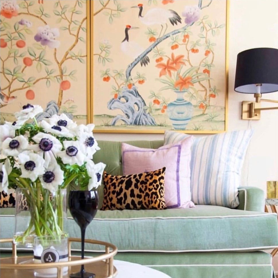
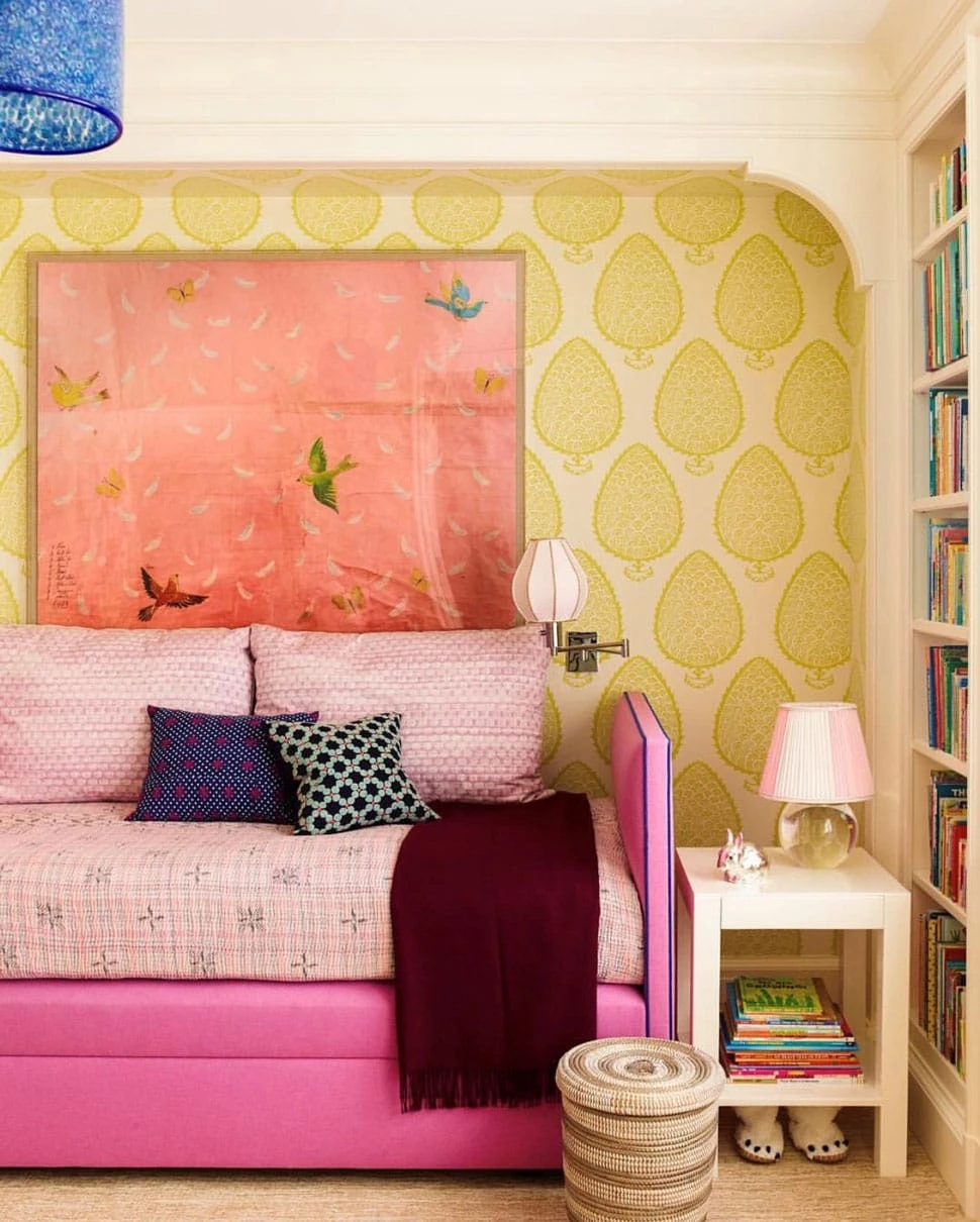
Image is shared on @societysocial Instagram account
Explore different color combinations to create different moods.
It is known that blues and greens tend to be more calming, which is why we find those hues in many spas. While you may find red exciting and energizing, another may find it unnerving or irritating. In a complimentary color scheme, two hues from opposite sides of the color wheel are used for the main and secondary areas. Main areas meaning floors (like tile and hardwood), walls and ceiling, while secondary areas are large upholstered pieces, area rugs and window treatments. These hues generally are repeated in stronger chromas in the accent or minor areas like throw pillows. I’ve found that the use of exact compliments like blue and orange are less pleasing than using opposite colors that are slightly tinged with some underlying hue. For instance, a yellow green harmonizes well with a yellow-tinged red. Yellow becomes the common denominator between the two compliments.
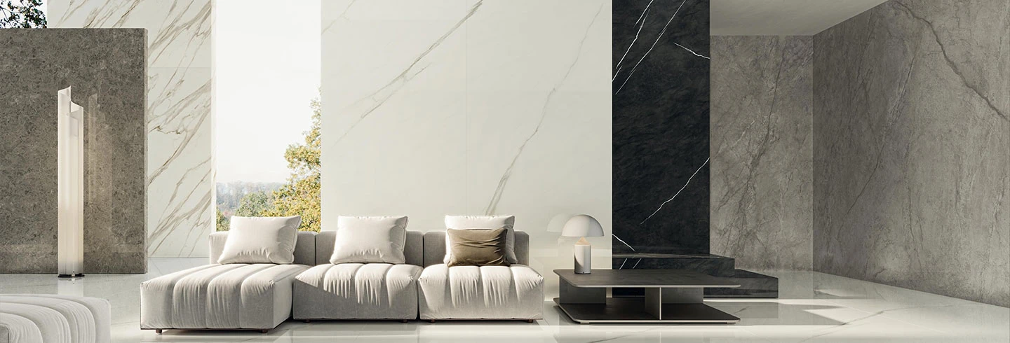
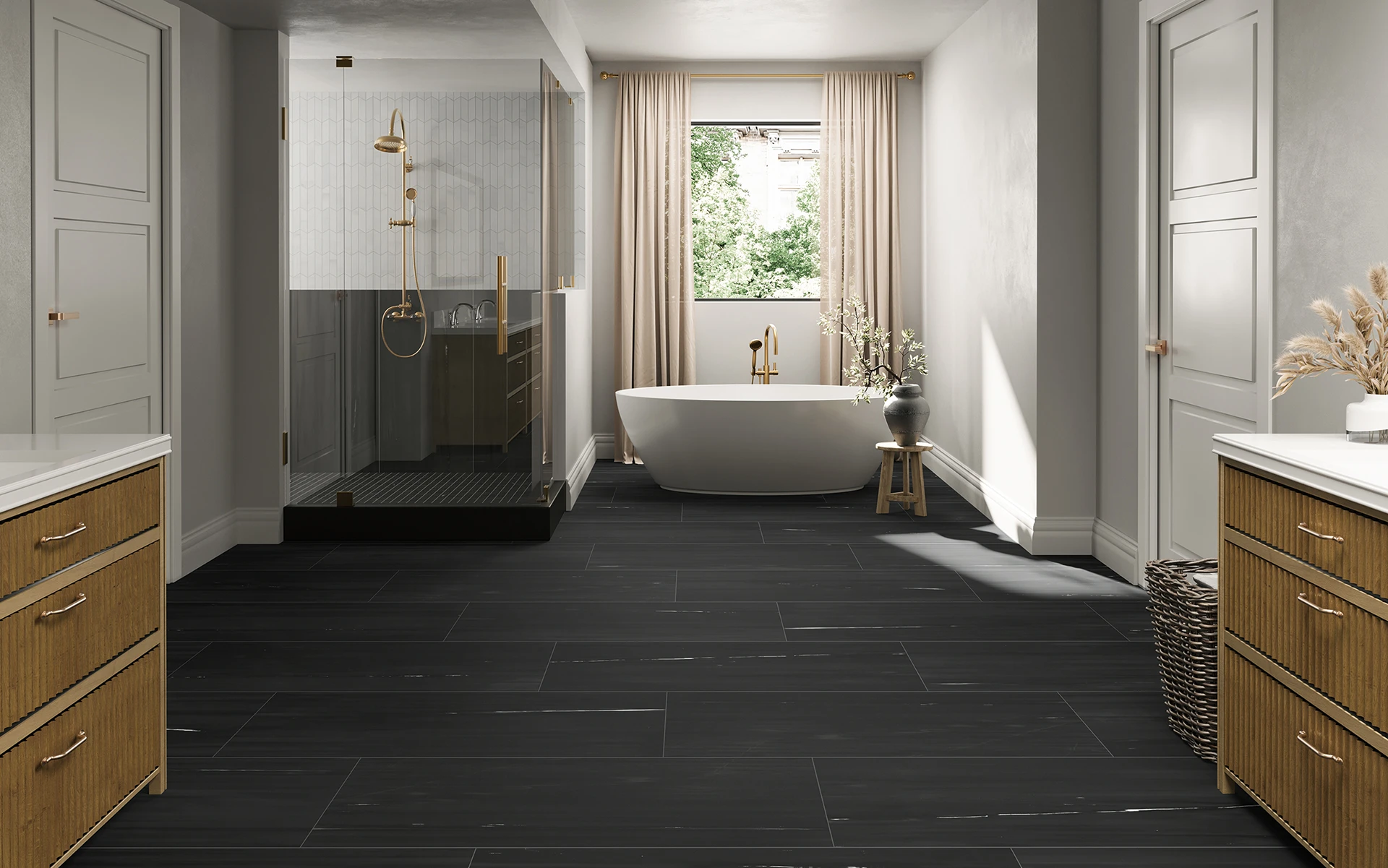
It is also worth noting that complimentary colors heighten the intensity of each other. White, gray and black don’t need to be counted as extra colors in a basic scheme, because their neutrality lends unity. My color theory professor emphasized that every space needs a touch of black for anchoring and contrast. The color wheel is a starting point for exploration but color preference is personal, so trust your choices.
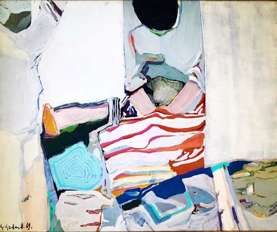
Image is owned by Laurie Smith @lauriesmithofficial
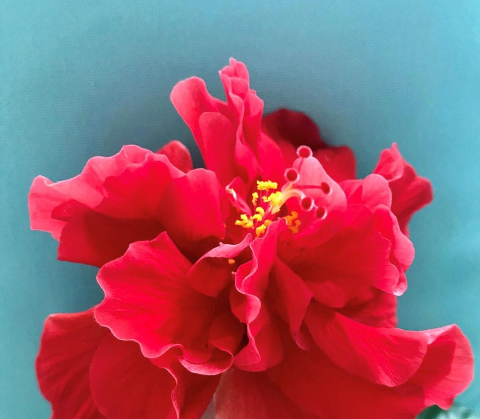
Image is owned by Laurie Smith @lauriesmithofficial
Turn to your favorite artists and nature for inspiring color combinations.
The study of color is fascinating, and I have often turned to some of my favorite artists for inspiration. Artists for centuries have placed color to intentionally ignite emotion when one gazes upon their canvas. One of my personal favorites, French painter Gabriel Godard, has always proved masterful with color.
Of course, many artists are influenced by the endless color palettes in nature. Intricate color combinations within a flower have inspired many a painting. I once designed a room based on a palette of blues, yellows and grey after taking a photo of a Ginkgo tree that had turned brilliant yellow against a Prussian blue sky. I will always recall an artist comparing their placement of color to a jazz concert: if separated, the notes seem somewhat off, but together there is harmonic composition. I love this analogy and encourage you to have fun composing your own concert of color in your interior spaces.
