“People are ready to bring color back into the home,” says Andrea Magno, color marketing and development director at Benjamin Moore. While cooler colors like blues and greens have reigned in the past, we’re starting to see a shift to warmer colors, Magno adds.
So, how does one make the right tile choice in their kitchen, bathroom, or entryway around such main character energy? It’s all about contrast and blending. Read on to take a deeper dive into how porcelain tile pairs perfectly next to such confident colors.

The Bathroom: Pair a neutral tile alongside bold accent walls for a warming contrast
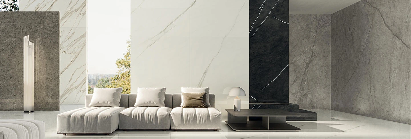
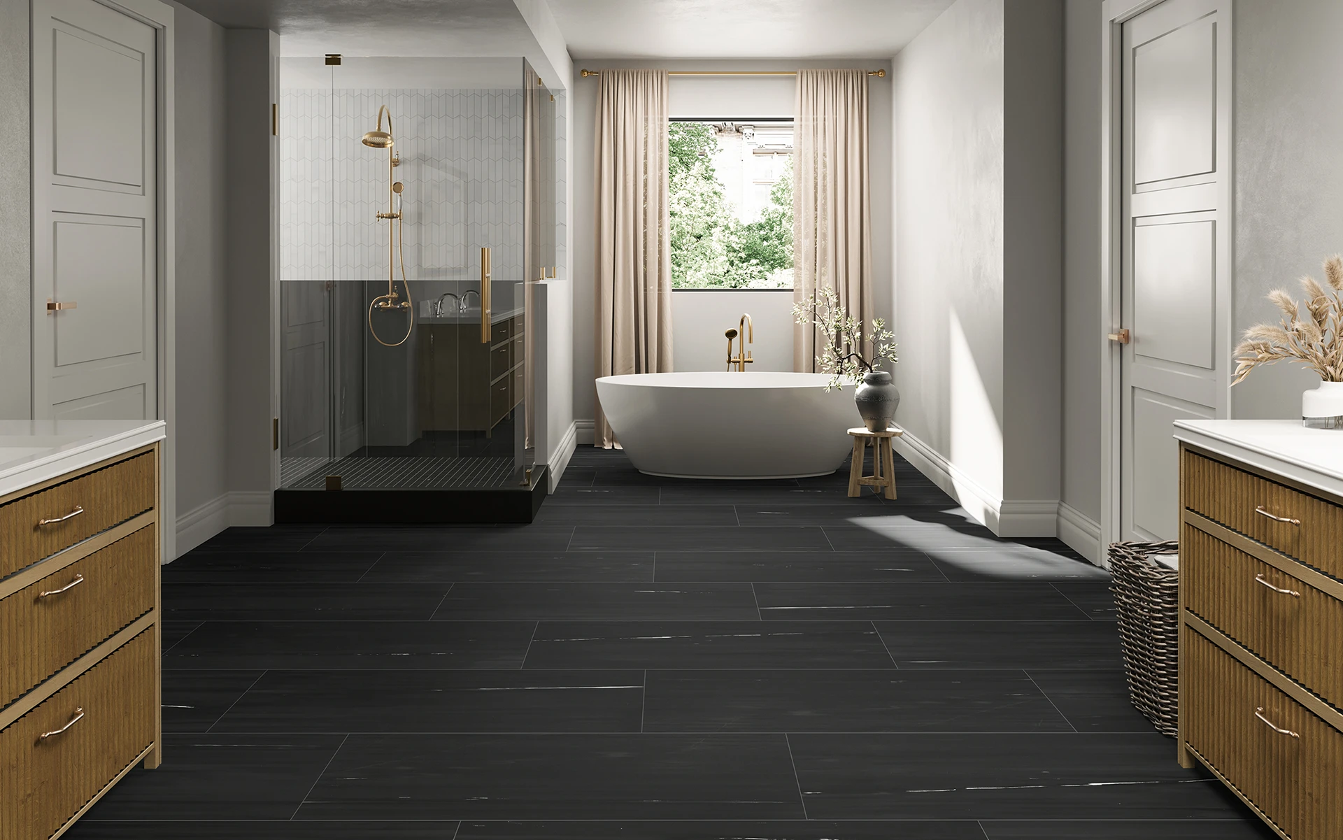
Homeowners can ease into adding color with a striking accent wall in a bathroom. In these smaller, often adjacent spaces, experimenting with a fiery-red accent wall or a patterned magenta wallpaper is a good first start at introducing color into the home. Contrast this pop of color with a calming, neutral marble-look porcelain tile for a shower wall or bathroom floor. Thanks to the timeless look of natural stone, marble-look tile can be matched with any type of interior design, from the most classic style to the daring and playful.

The Kitchen: The options are endless with backsplash design – go neutral or try out a mosaic pattern
When it comes to the kitchen, homeowners shouldn’t be afraid to add a deep pink accent wall, barstools in an inviting rose color, or even kitchen cabinets in a dreamy blush tone (all colors rising in popularity in 2023). Blend these warm colors with a lighter porcelain tile backsplash and see the space come together. Try Atlas Concorde USA’s Element stone-look porcelain tile collection in an ivory or silver hue to bring a sense of synergy into the kitchen. Alternatively, lean into the bold and embrace a backsplash with a compelling hexagonal or honeycomb mosaic in marble-, stone-, or even metal-look porcelain tile that is certain to pair nicely with a statement-colored cabinet or accent wall.
The Entryway: Welcome guests into a space that blends charismatic energy with a sense of grounding
As we look towards a post-pandemic world where people are eager to embrace joy, go ahead and paint the front door a raspberry shade, buy the red, upholstered sofa, and embrace a warm-saturated accent wall. While these colors might command a room with their boldness, visitors to the space can feel grounded with a neutral-colored tile floor. An earthy stone-look porcelain tile from Atlas Concorde USA’s Exist collection makes for a perfect contrast, as its organic aesthetic and natural elegance create comfort and relaxation. A natural wood-look porcelain tile with realistic grain patterns and visible knots is a welcoming option as well in a light wheat from the Homeland collection or in a golden wax color from the Redeem collection.
In 2023, be color confident but let neutrals keep you balanced
As homeowners turn to more adventurous colors and look for ways to add personality to their homes, a grounding design element becomes a crucial sidekick. “It’s all about our desire for creative expression,” says Laurie Pressman, vice president of the Pantone Color Institute. “Understanding that our surroundings influence our mental health, many are expressing their creativity in the home as a way to enhance their feelings of joyfulness and well-being.” Vibrant colors and calming neutrals enable that joy and sense of well-being to go hand in hand. With a variety of finishes, colors and designs, porcelain tile becomes an ideal pairing for the warm, bold colors of 2023.

Check out more ways to style a home with the colors of the year and Atlas Concorde USA’s numerous tile collections on Pinterest, Instagram, Facebook and Twitter.


